Medit was a self-funded startup. It was a tool to help healthcare professionals — doctors, nurses, pharmacists etc — to discover, read and organise content. That content could be anything from blog posts, to podcast episodes, to YouTube videos, to medical papers.
I joined the company just as the first version of the app was being released in the AppStore. I was a solo designer in an Agile team with developers, data scientists and a marketing/social media department.
Prototyping a stronger first impression
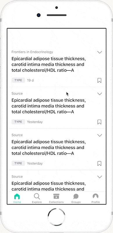
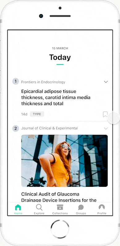
For the first versions of our Home screen we tried the ubiquitous vertical infinite scroll.
After a while, we started noticing a concerning pattern in the analytics: users were spending very little time in the app. They would scroll for a few seconds and leave. We reached out to people, did a few interviews and were able to get a few insights:
- the screen was too cluttered;
- too “text-heavy”;
- difficult to understand;
- there was a disconnect from our marketing messages: we were promising this new brilliant solution for content clutter, but we were delivering the same old long list.
People were, understandably, disappointed.
We took a step back. We looked for alternate ways to display rich & varied content. Apple’s App Store and Wikipedia for iOS looked like good options: timely, featured content, different display options, multi-directional scrolling with carousels.
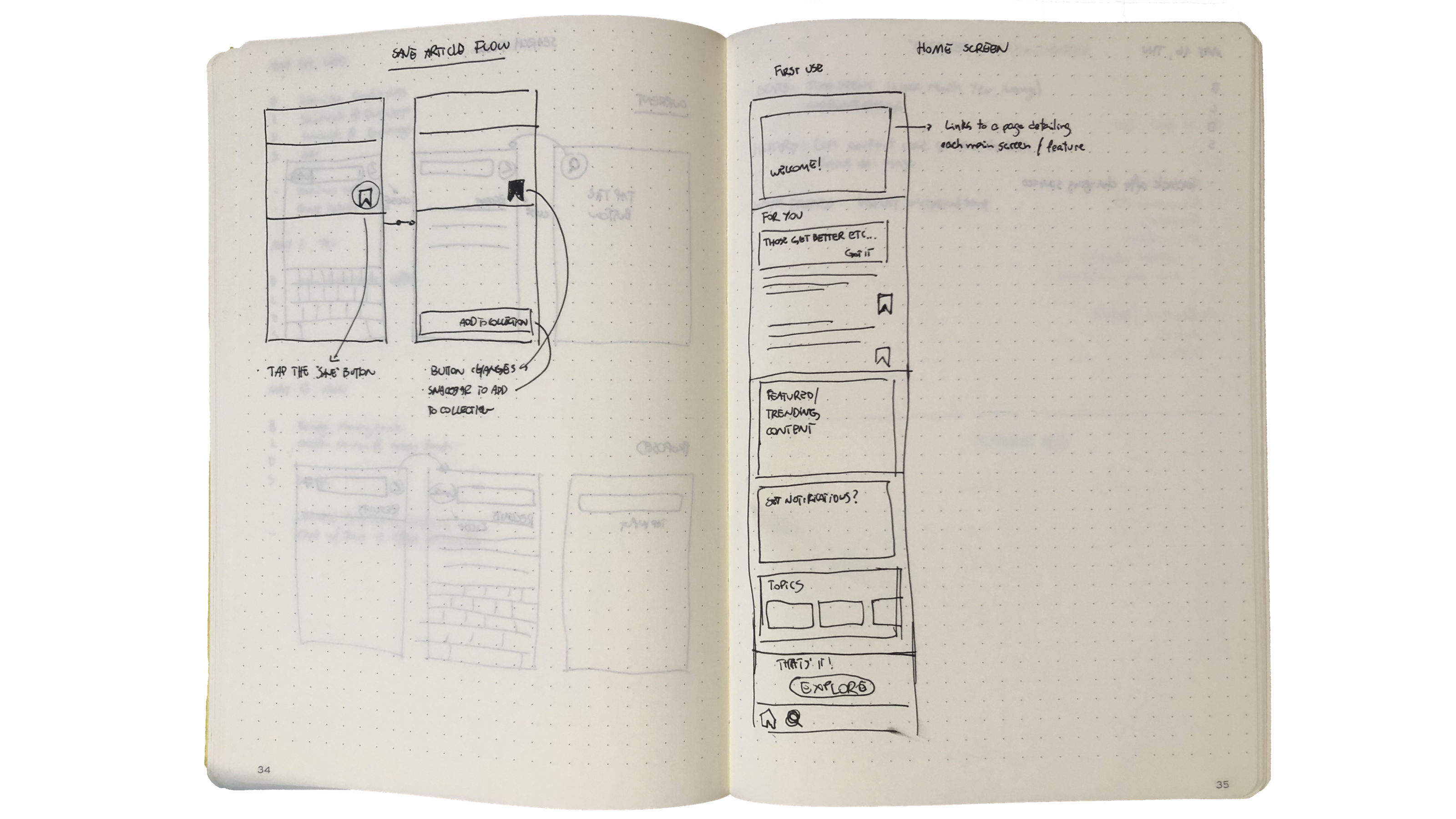
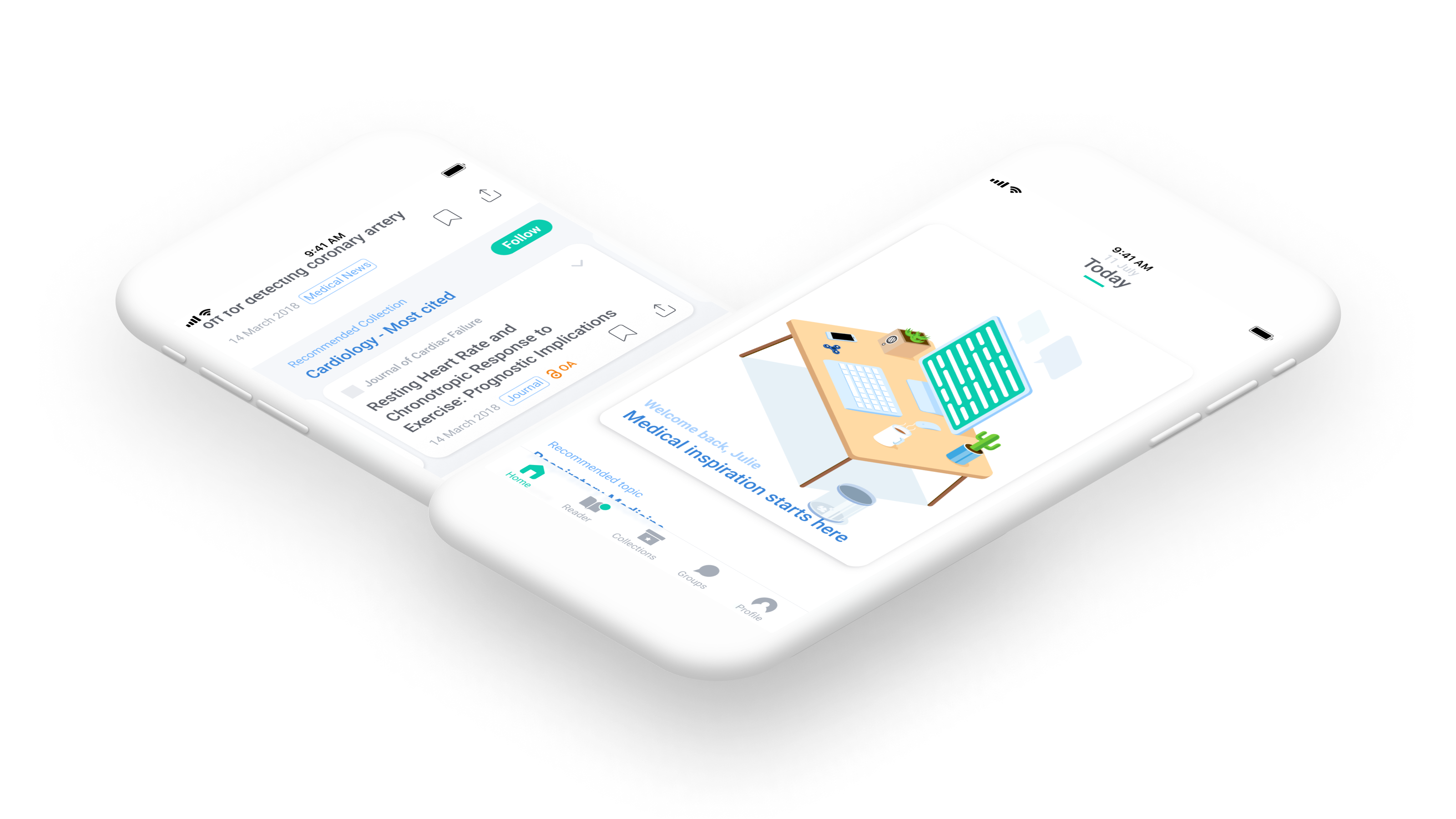
Sketching a new Home Screen
And I got a simple prototype to get buyout from the team:
Old Home x New Home
After a few sprints, we rolled out a much more attractive and interactive Home Screen. Cards for featured content and important information, quick lists and carousels for the curated content. We moved some of the functionalities to different screens. Experience became much more focused!
That change increased the time spent in app, with users taking more time to explore. And one unexpected benefit: it opened up opportunities for extra revenue through promoted content.
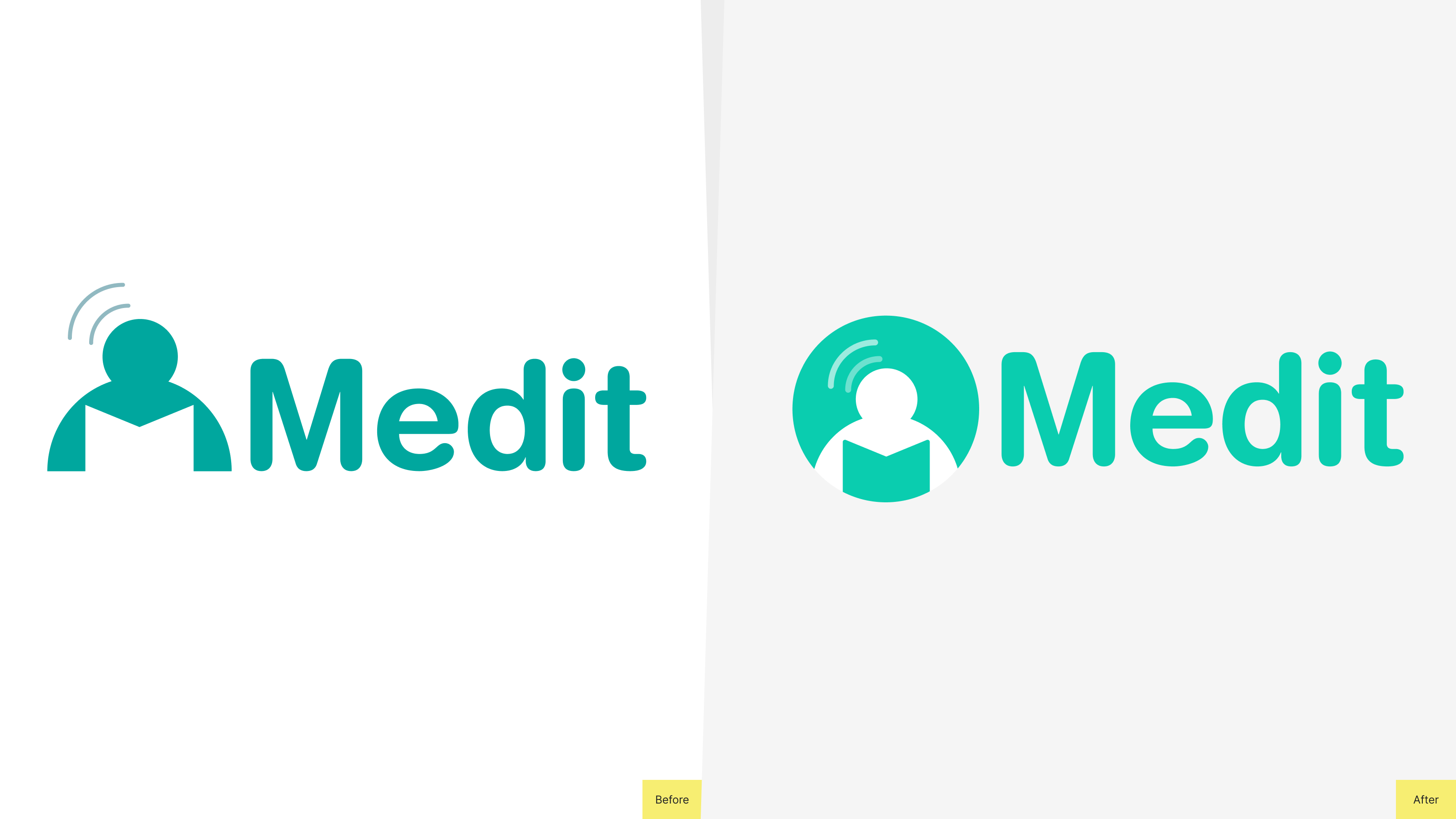
A more dynamic brand
Streamlined the logo and added alternate lockouts and colour variants to make it stronger across different channels. Developed a more flexible colour palette with multiple tints and shades to empower the marketing team.